The Simple Guide to Pixels, Resolution and dpi
Page created 15th June 2011
There is some confusion over the meaning of pixels, resolution and dots per inch (dpi). Pixels and resolution are closely linked and relate to the screen or monitor, as well as images and other material displayed on them, whereas dpi relate to printable material.
Screens, pixels and resolution
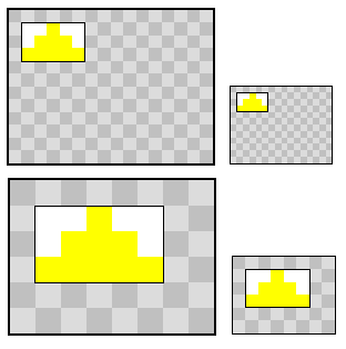
To make it easier to visualise resolution, I created an image (above) representing simplified screens with each square representing a pixel. The area of a screen is divided up into a certain number of pixels. This is the screen's resolution.
Because the pixel number displayed and screen sizes vary greatly, from tiny mobile phone displays to 30" monitors, the number of pixels are more difficult to translate into resolution in a meaningful way, which is why the resolution is also referred to as pixels per inch - ppi.
There is a maximum amount of pixels any given screen can display, depending on its specification, but the resolution can be reduced by changing the setting of the screen. This has the effect of reducing the number of pixels showing, increasing their size and therefor magnifying the displayed content. The two screens on the far left are the same size, but the top one has a higher resolution of 16 pixels by 12 pixels, and the bottom one 8 pixels by 6 pixels. In the lower one the yellow triangle image appears twice the width and height of the top one, even though it is still 5 pixels by 3 pixels. The smaller screens on the right of the image have the same number of pixels as those on the left, but are only half the height and width. Their resolution is thus twice as high, because there are more pixels per inch of screen area.
Pixels do not have a fixed size. Their size is relative to the screen's resolution. The image of the yellow triangle has the same number of pixels in all examples, but shows at different sizes according to the resolution.
Although screen sizes vary greatly, in practice, they often have similar resolutions. As an example, my laptop has a screen measuring 13" by 8" with a top resolution of 1280 by 800 pixels. This works out at around 98 ppi. Many computer displays have similar resolutions, therefor objects like images display at similar size on different screens, but may take up more or less of the overall percentage of the screen, depending on the screen's size.
Most objects intended for display on a screen are measured in pixels. For example, images, videos or web pages with fixed dimensions are measured in pixels. If an image measures 600 pixels by 300 pixels, then it will display at approximately 6" by 3" on a screen with 98 ppi resolution.
Dots per inch
Same pixels, different dpi in each image - screenshot of a word document
Images have various information encoded in them, including the number of dots per inch specified in the Save process. Dots per inch or dpi is a measure only recognised in software applications which are designed for preparing material for print, such as various office and desktop publishing applications, and is directly related to the actual measurement of the image on the printed page. It is not generally recognised by web browsers or image viewing software. This information is separate from the pixel information. For better print quality the dpi value should be 300 or more dpi.
When an image is originally saved for print and given a dpi figure, the dpi are at that point related to the number of pixels present in the original image. In other words, the pixels are converted to dots per inch, and there can only be as many dots as there were pixels, and there have to be more to be squeezed into the same space as the average screen display. For example, every inch of paper of screen equivalent, has to have about three times more dots to fill it than the average screen display would need at around 98 ppi. This is why it is important to keep original, large images. Pixels or dots can not be added later.
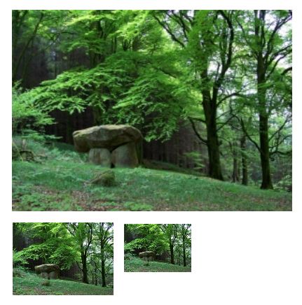
The three dolmen images above were all saved with the same pixel dimensions, but each was saved with a different dpi size. The first has 72 dpi, the second 200 dpi and the smallest is 300 dpi. The image on this page is a screen shot of all three images imported into a word document which is capable of recognizing dpi information, and thus displays the images in different sizes. All images measure 300 pixels by 216 pixels. The image saved at 300 dpi would therefor measure 1" as all 300 dots (original pixels) would fill an inch.
So what about saving images at 72 dpi for web use?
There is a lot of misinformation about saving images for the web with 72 dots per inch. It makes no difference to the file size or display size, since browsers ignore dpi information of images, and only interpret the pixel information. To demonstrate, the three original dolmen images from the above screenshot are here shown on a web page, viewed through your browser. They are the very same images. Each one is 300 pixels by 216 pixels, and displayed at that size. Each one is 39.8 kb and each one has a different dpi value, as mentioned above. You can check the pixel dimensions and file size by right-clicking the image and looking at Property. If you right click and choose Save Image As for each of those three images you will be able to see in an image viewing application what the dpi figure is. By the way, the images would have to be "saved as" or embedded rather than copied and pasted for the information to remain intact.

Image saved with 72 dpi

Image saved with 200 dpi

Image saved with 300 dpi
As you can see, saving the image in different dpi size makes no difference to the file size, quality or dimensions. So why the myth about saving images at 72 dpi? Although browsers ignore the dpi information of images, they have to interpret fonts in some way, and have come to some consensus that the average browser has a resolution of 72 pixels per inch and display fonts accordingly. That is as much as I understand about it. Somehow the 72 dpi has crept into the idea that images have to be saved at that dpi.
There is, however, a good reason for considering dpi for web use. Although the browser ignores the information, it is still contained in the image. If an image is likely to be used for print, it is better to save it at 300 dpi. It won't add extra bytes to the image, there is no waste, only a better quality image for print. Conversely, if you want to protect images from plagiarism by print, the image can be saved at a very low dpi figure.
Update: The last paragraph above is not strictly true. As Saurabh stated in the comments, the dpi can be changed back up. Therefore, the dpi as stipulated in the web image in itself does not make a lot of difference to print quality. It is, however, still the total number of pixels which need to be squeezed into a print image which determine the quality of the print. In other words, the 300 pixel wide image raised from 72 to 300 dpi would still end up 1" wide on the print document, or at lower dpi would be blurry. So, if you want to provide images for print make sure the pixel count is 300 times larger than the physical inches you want displayed. For example, if you want the printed image to be 5" x 3" the pixel count would have to be 1500 x 900. If you want to prevent plagiarism (for print only) don't provide large images. They are rarely justified anyway and are mostly bandwidth robbers.
You might wonder, if the image looks sharp on screen, why can't you use the same dpi figure as screen resolution? It would display physically the same size, but printed images loose some of the crispness. This has to do with the difference in how the image is constructed with ink. There is a more detailed explanation on this at Wikipedia. If you scroll down nearly half way, you will see an image simulating a screen image and print image "under the magnifying glass" which makes it very obvious.
Sizing images for web pages
One mistake I often see when people insert images in web pages, is to "reduce" the image by specifying a size in the code. This does not reduce the file size, only squeezes the full image into the allocated space. The two images below are the same image. Same dimensions, same file size. The only difference is that the smaller one was given a fixed dimension in the code. Again, if you right-click the images, you will be able to see that they are identical. You can also choose "View Image" when right-clicking the small image, which will open it in a new window or tab at the original size.
If you are using blog software or some WYSIWYG editor, the software may be asking you what size image you want. I repeat again: this does not reduce the image in file size by adding the size stipulation code. It only makes it appear smaller on the screen.
The purpose for the image size specification in the code is not to re-size an image but to tell the browser when a page is loading how much space to hold whilst the image is loading. Images typically load slower than text. If the size of an image is not specified, the page will readjust the content on the fly as the image is loading at a different rate. You see this happening when a page loads and the text is jumping all over the place whilst images gradually "unfold" until all the images have loaded fully. If you wish to specify the size of images (or video) for smoother page loading, it is best to do so after re-sizing the images in an image editor.
To reduce an image for web use, resize it in an image editor. Resizing images will save you a lot of bandwidth and load time for your readers, as well as energy. File transfers use energy, the greater the file, the greater the energy use. Bandwidth is also money - for you and your readers.
There are other ways to reduce images, but that is a separate subject for another article.
Sorry, some of the instructions above are for Windows. On a Mac it is quite easy too with the Preview app.

250x300px, 23.9kb image embedded in page without size restriction
250x300px, 23.9kb image embedded in page with restriction of 100px width and 120px height
Resources
Here are a couple of useful tools and applications for image sizing and editing. They are free or low cost for the pro versions, where applicable.
A must-have for Windows users: irfanview . This image editor is one of the most popular, and for good reason. It is fast, versatile and free. It is the instant app to resize, trim, save as various formats and save in the dpi of your choice. There are many more features. On the Mac you can use Preview for most resizing. Here is a link to an old tutorial.
Very useful: Screen Callipers for measuring pixels and other dimensions on screen. The basic version is free, but lacks some features, and shows a nag screen when you open the app. It also switches the yes/no buttons around, just be aware. $29.50 or so to buy. Available for Mac (up to Snow Leopard) and Windows.
Web Hosting
If you are looking for website hosting, DreamHost (affiliate link) is a quality web host who has been around for many years. They have many of the features you would expect from a modern host, including fast SSD servers and easy install Wordpress software - all at a very affordable price.
Click the image below for more information.

Update 2016
Since this post was written there has been an explosion of devices with many different resolutions, including retina displays. This has made the topic more complex, however, in practice things are not so different now. Operating systems for retina devices translate the retina pixels to an equivalent "old-style" pixel. In other words, that 200px image has not shrunk to a tiny thumbnail. It is just more crisp. That said, any non-retina resolution of recent years is pretty good quality and the difference is hardly discernible to the human eye. We are not talking 1980s space invaders resolution! Before you change all your website images to high resolution, consider the trade-off - does it really justify the bandwidth?